Conheçam em detalhe a analise que
Fonte: BuildZ
The Wind Tunnel analysis available in Vasari 2.1 is mesmerizing.

. . . I think my building is going to suck pedestrians off the sidewalk. Mwah-hahahaha!
For basics on how to use the functionality, check out this link.
Now, a couple other things I like to consider when jumping in on this tool:
- Use 3d analysis for more robust results: 2d is fast, but only takes a small area of your model into consideration

- Let the analysis run for a while before really looking at it: crunching voxels is hard work, and you wanted to get some coffee anyway.

- Pause your analysis before exploring it: Moving around the data slice and using other methods of visualizing the analysis is where the fun comes in. This takes computing power, so you’ll want to stop analyzing and start visualizing.

The default behavior is to use “2d analysis”, which is very fast to calculate, but only takes into consideration the winds and geometry of a flat plane.
This is what I get after only a few seconds using the default settings on my model.

Now, this is fine, it gives you a good starting point to understanding your model. But with my corkscrewing geometry, I’m pretty sure that I’m getting a vigorous 3 dimensional churn, probably a big rush of wind coming up from the

This is where you will jump from “real time” to something more intensive. For instance, on my 8 core machine, I popped on 3d analysis, waited 4 minutes, and had this
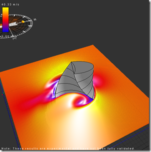
Notice how most of the area around the model is not very differentiated? This is because my computer is just beginning to process all the voxels. With that one button push I go from 15,626 2d cells to 1,515,625 3d cells being analyzed. But you can also see the
8 minutes after start:
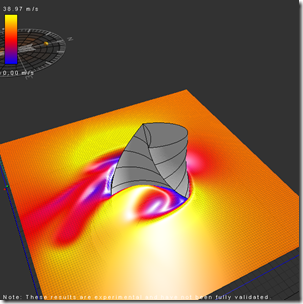
20 minutes:

After about 40 or 50 minutes my simulation started wavering back and forth between this

and this.

At which point I say “good enough” and pause the Real-Time Analysis:
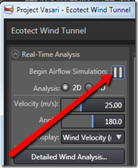
Which allows my processors to go from this:
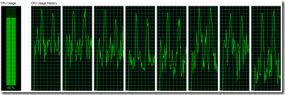
to this:

Whew!
So with the analysis paused, I’m freed up to explore the model. If I left it still processing the data, it wouldn’t leave much of my poor machine’s brain power to manipulate the views, like scrubbing the XY slice up and down, or better yet, playing with the 3D Volumetric controls (more on that in another post).
One quick thing I can do is look at various slices of the data. If you go to the 2D Grid slice tab, changing the 3d Axis will give you this:

Now compare that with my nearly immediate results from the 2d analysis’ vertical slice

You can see that there is certainly a relationship between the 2d and 3d analysis in terms of directionality and relative intensity of the wind velocity. But you can also see some significant differences. For instance, let’s adjust the Data Display to have the same Minimum/Maximum range displayed:

Going from an initial range of 0 - 102 m/s, I change the 2D analysis to match my 3d analysis of 0 - 32 m/s

So this is more of an apple to apples comparison of 2d to 3d:

Lots more to say on this functionality, we haven’t even looked at this stuff:
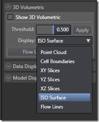
. . . stay tuned.


Sem comentários:
Enviar um comentário